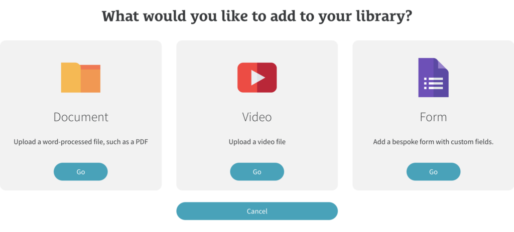
In Library, click on the ‘Add’ button on the right hand side of the screen.
You’ll then be asked what you’d like to add to your library.
Click on ‘Form’ and then you’ll be asked to give your form a name and if you’d like to add any pre-built sections. Pre-built sections are optional but can speed up the form building process.
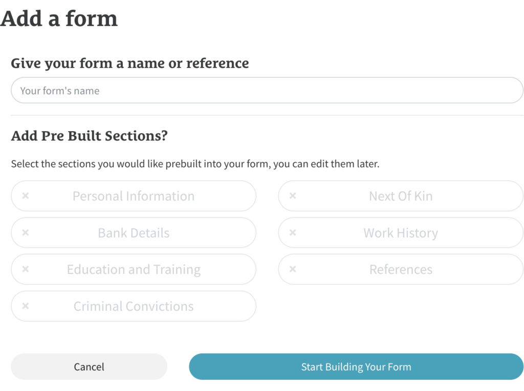
Once you’ve added your form name and any pre-built sections, click ‘Start Building Your Form’.
The Form Builder
If you chose to add any pre-built sections, these will now be listed under ‘Sections’ in the left hand column of the main screen. If you chose to build your own form from scratch, you can click on ‘Add Components’ at the bottom of the screen to get started.
You can add a description to your form to help you identify it in your library. Remember to click ‘Save Form’ when you have finished.
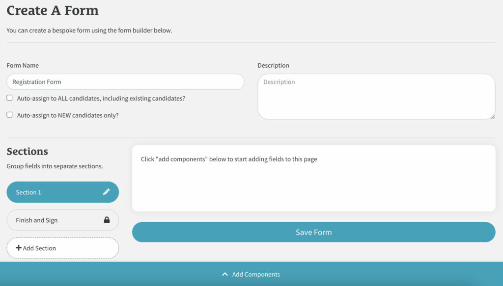
Auto Assigning Your Form (Optional)
You have two options if you’d like to auto-assign your new form.
1.Auto-assign to ALL users, including existing users
If you select this option, when you save your new form, it will automatically be sent out to ALL users already within your system as well as any new users that then register.
2. Auto-assign to NEW users only
If you select this option, when you save your new form, it will only then be sent out to any new users that register.
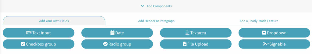
Adding Components To A Form
Click on the section you’d like to add your component to, then click on ‘Add Components’ at the bottom of the screen to find three sections to choose from. Once a component has been added, it will appear at the bottom of that section
You can then drag and drop the component to change the order in that section or click on the pencil icon to edit it.
1.Add Your Own Field
Text Input
This is a single-line input field used for things like ‘First Name’, ‘Surname’ etc. Once selected, you’ll then need to give it a name (Label) such as ‘First Name’, and then you can choose to make it mandatory by ticking the box on the right. Click ‘Add Input’ to add the field.
Date
This is used to add a Date field for things such as ‘Date of Birth’ etc. Once selected, you’ll then need to give it a name (Label) such as ‘Date of Birth’, and then you can choose to make it mandatory by ticking the box on the right. Click ‘Add Input’ to add the field.
Textarea
This is a multi-line input field used when you need the user to write a fuller answer such as employment history details etc. Once selected, you’ll then need to give it a name (Label) such as ‘Employment Details’, and then you can choose to make it mandatory by ticking the box on the right. Click ‘Add Input’ to add the field.
Dropdown
A dropdown is used if one selection is needed from a list such as ‘Branches’. Once selected, you’ll then need to give it a name (Label) such as ‘Branches’, and then you can choose to make it mandatory by ticking the box on the right. To add your list options, add an option into the ‘Option 1’ field, then click on the plus icon (underneath and on the right hand side) to add another option. Click ‘Add Input’ to add the dropdown when done.
Checkbox Group
A checkbox group is used when you require multiple selections from a list such as giving the option to select multiple branch locations in one area. Once selected, you’ll then need to give it a name (Label) such as ‘Branches’, and then you can choose to make it mandatory by ticking the box on the right. To add your list options, add an option into the ‘Option 1’ field, then click on the plus icon (underneath and on the right hand side) to add another option. Click ‘Add Input’ to add the checkbox group when done.
Radio Group
A radio group is used when you need an either/or answer such as ‘Yes’ or ‘No’. Once selected, you’ll then need to give your radio group a name (Label), and then you can choose to make it mandatory by ticking the box on the right. To add your answers to select from, add an option into the ‘Option 1’ field, then click on the plus icon (underneath and on the right hand side) to add another option. Click ‘Add Input’ to add the checkbox group when done.
File Upload
File upload is used when you need the user to upload a file such as a Driving license or CV etc. Once selected, you’ll then need to give it a name (Label) which will let the user know what you’d like them to do, such as ‘Please upload a copy of your driving licence’, and then you can choose to make it mandatory by ticking the box on the right. Click ‘Add Input’ to add the field.
Signable
A signable area is used when you need an additional signature to any part of the form. Once selected, you’ll then need to give it a name (Label) which will let the user know what you’d like them to do, such as ‘Please sign below’, and then you can choose to make it mandatory by ticking the box on the right. Click ‘Add Input’ to add the field.
2. Add Header Or Paragraph
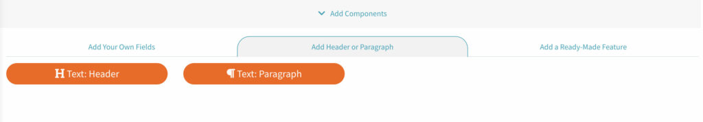
Text: Header
This is used if you’d like to add a header to your form such as ‘Personal Details’. Once selected, you can add the heading ‘Content’ and then click ‘Add Header’ to add this to your form.
Text: Paragraph
This is used if you’d like to add any text to your form to give information to the user. Once selected, add your text where it says ‘Add text’ and format using the controls as required. Click ‘Add Text’ to add this to your form.
3. Add A Ready-Made Feature (Pre-Built Section)
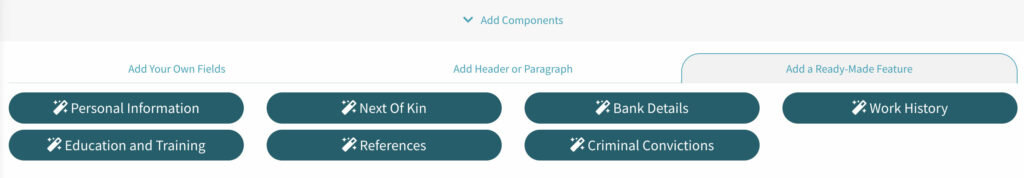
These are same pre-built sections you were asked initially if you’d like to add. Add them at anytime to speed up the form building process.
Any pre-built sections added will appear in the Sections panel on the left on the left side of the screen.